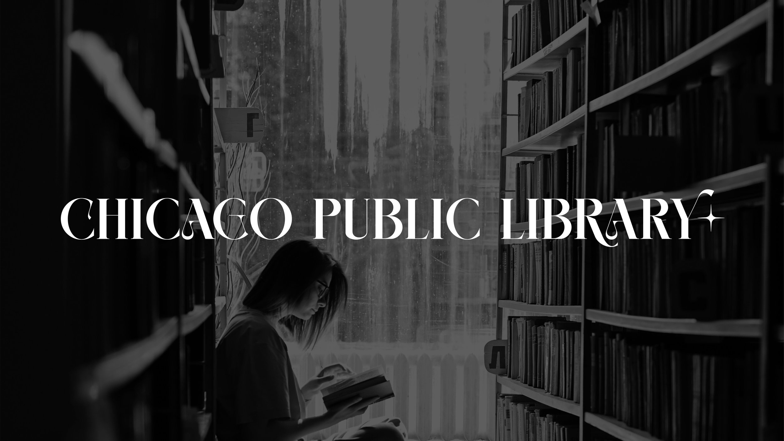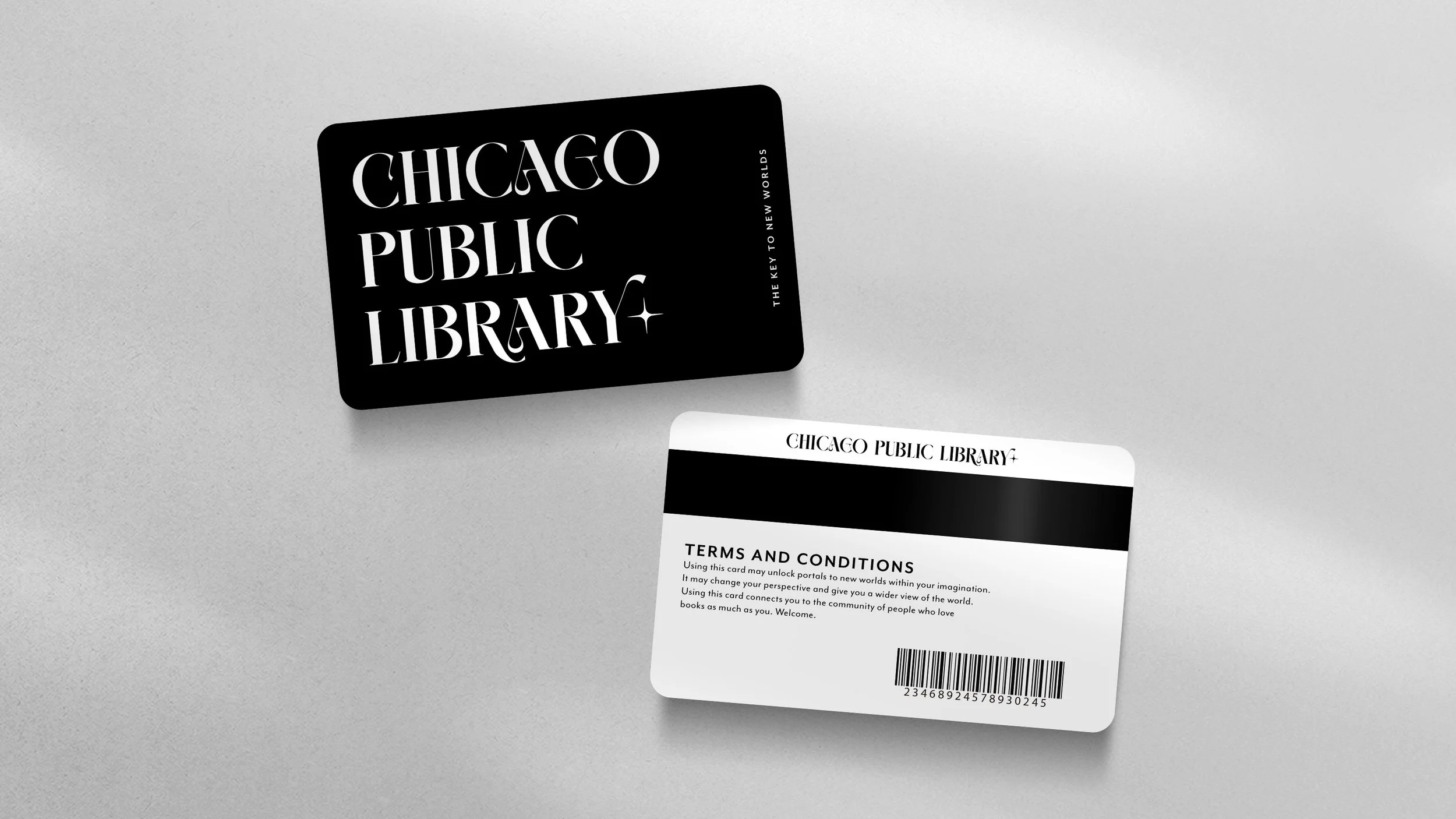
In early 2022, I decided to take an Art Direction course to sharpen my skills and expand my ability to concept and create great work. One of the projects was to rebrand the Chicago Public Library. I chose to create a logo that used a serif font to honor the traditional and innate respect that comes with a library, but that also felt whimsicle and other-wordly. Books transport us to new places within our minds, allowing us to escape the reality that we are currently in. So I decided to really lean into that concept, not just with the logo but also with the print collateral.
One of my ideas was to have CPL collaborate with Roooms, a free metaverse platform. Different rooms could be created for different books, where fans could continue their affinity for the book within the metaverse along with others who loved the book just as much as they did.
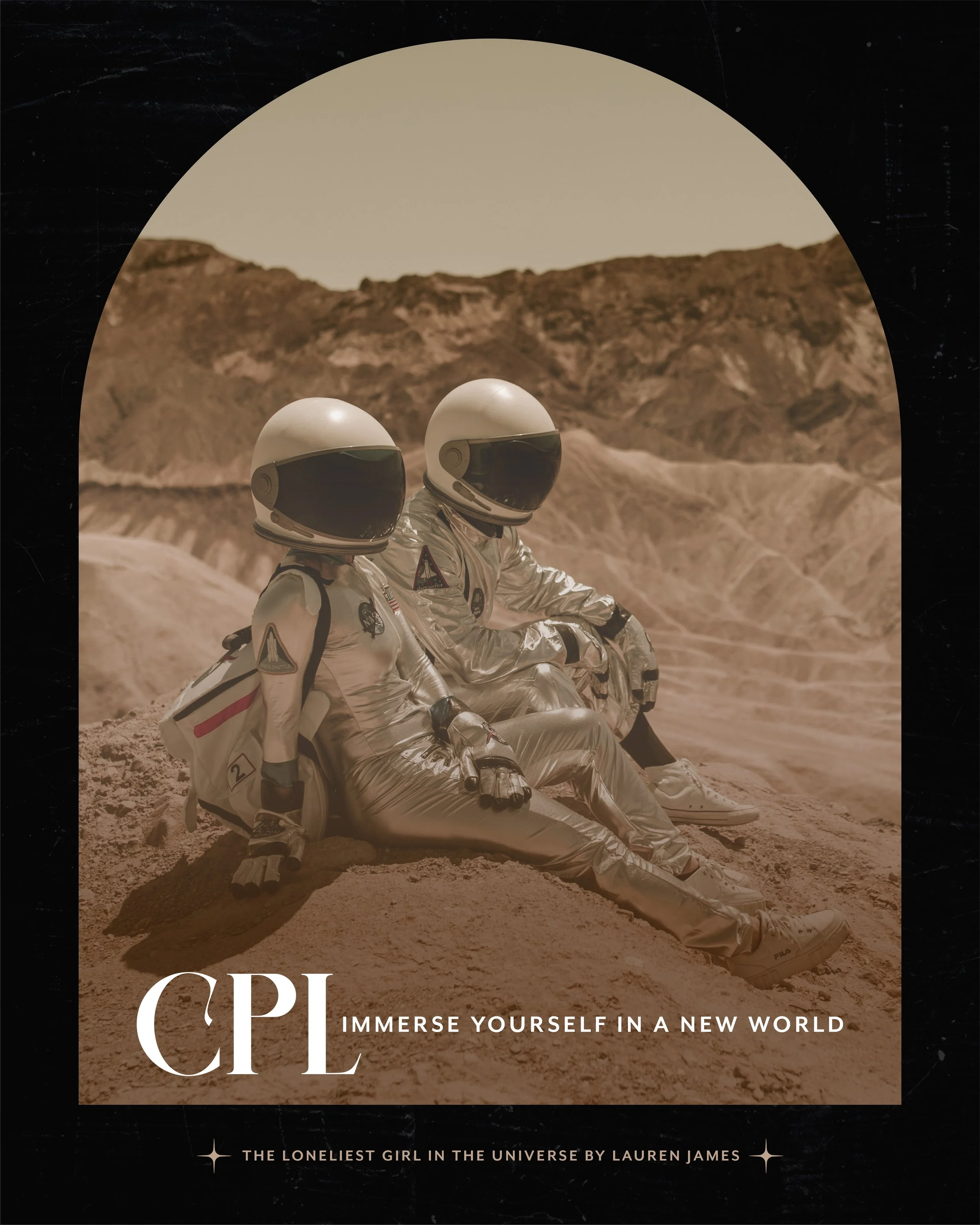
The campaign for CPL, encouraging people to immerse themselves in a new world, would be supported by beautiful images inspired by settings within books across different genres. The photos would be captivating and cinematic - urging the viewer to pick up the book to experience that particular world.
The Course:
How to Become an Art Director with Joel Arzu


